
Our Core Services
Have you ever gone to a website on your smart phone just to end up pinching, zooming, and fighting to read the text or tap a button? The all-too-frequent frustration speaks to exactly why website responsive design is so critical for companies that want to stay ahead of the competition. If your website adjusts perfectly to any screen size—be it desktop monitor, tablet, or smartphone—you’re not just enhancing user experience; you’re laying the groundwork for digital success.


Responsive website design is a method where the layout, content, and functionality of a website change automatically to offer a good viewing and interaction experience on all devices and screen sizes. In contrast to older fixed-width websites that were built only for desktop viewing, website responsive employ fluid grids, flexible images, and CSS media queries to identify the screen size and orientation of the visitor and adapt the display correspondingly.
The governing philosophy of website responsive design is easy: design once, show everywhere. Instead of building independent websites for multiple devices (desktop, mobile, tablet), website responsive design enables one website that adjusts itself according to the user’s device.
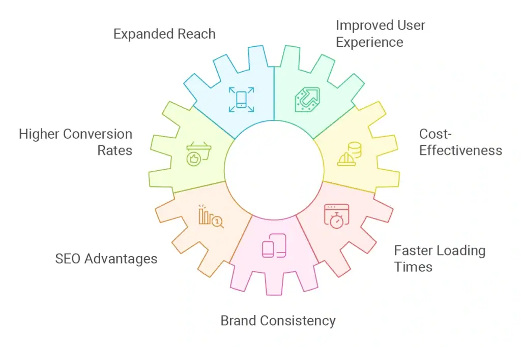
Introducing website responsive design provides important benefits that have direct implications on your brand image, user interaction, and eventually, your bottom line:
Given that mobile phones are responsible for about 60% of world-wide web traffic, having a website responsive means you will be reached by users no matter what their preferred device is.
Through the ability to adjust to various screen sizes, responsive websites render pinching, zooming, or horizontal scrolling unnecessary, providing intuitive navigation and effortless consumption of content.
Research indicates that users are 67% more likely to buy from a website responsive. Smooth, frustration-less performance automatically results in higher conversions.
Having one responsive website is more cost-effective compared to operating independent mobile and desktop sites, lowering development and maintenance costs.
Google favors mobile-friendly websites in search results. A website responsive site enhances your visibility and can enhance organic traffic.
Optimally optimised responsive websites tend to load faster than their non-responsive equivalents, lowering bounce rates and enhancing engagement.
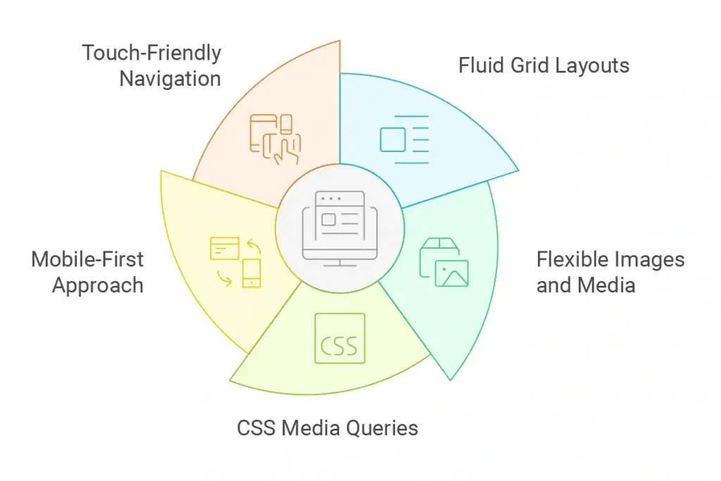
Responsive design employs relative units, such as percentages, in place of absolute measurements, as opposed to fixed-width layouts, such as creating a page that is precisely 960 pixels wide. This preserves the proportional relationships between elements while enabling content to flow and resize according to screen dimensions.
This method guarantees that the structure of your website adjusts proportionately to any screen size, preserving visual coherence across various devices.
To avoid overflow problems or needless scrolling, images and media components must scale properly across various screen sizes. Aspect ratios are maintained while visual elements never go wider than their container thanks to strategies like setting max-width properties to 100%.
In order to ensure optimal loading times without compromising quality, modern website responsive design also incorporates sophisticated techniques such as serving different image sizes based on screen resolution.
The foundation of website responsive design is media queries, which let programmers apply various CSS styles according to the width, height, orientation, and resolution of the device. For instance, media query breakpoints may cause a desktop layout with three columns to collapse to a single column on a mobile device.
Without altering the underlying HTML structure or content, these conditional styles aid in creating experiences that are customized for various screen sizes.
Before gradually improving the experience for larger screens, the mobile-first approach starts by designing for the smallest screen. Leaner, more focused designs across all devices are the result of this methodology’s forced prioritization of crucial functionality and content.
Prioritizing mobile constraints before implementing improvements for users with larger displays guarantees that your core user experience functions well on constrained screen real estate.
Compared to desktop users, mobile users engage with websites in different ways. By incorporating touch-friendly navigation elements with suitable sizing and spacing for finger taps (minimum 44×44 pixels), as well as taking hover states and dropdown menus into account, website responsive design takes these variations into account.
Whether using a mouse, touchpad, or touchscreen, users can navigate your website with ease thanks to thoughtful navigation design.
To build a responsive website that offers outstanding experiences on all devices, adhere to these eight easy steps:
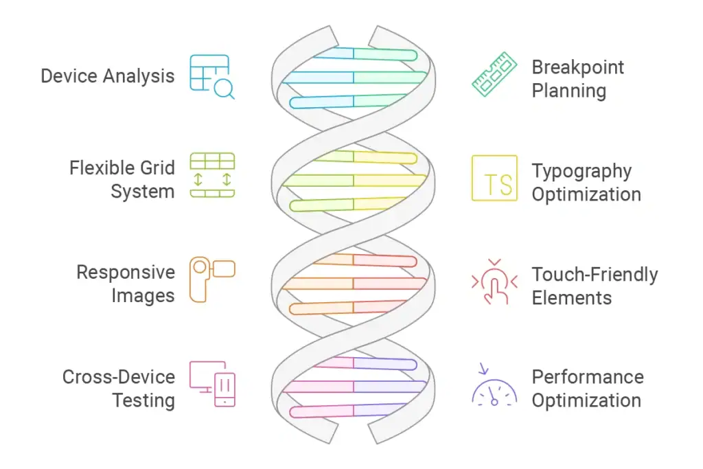
Examine your analytics to find out what devices your audience is currently using. Determine the most popular screen sizes and give these devices top priority for optimization while maintaining spectrum compatibility.
Identify the critical screen widths (breakpoints) at which your layout must change. Although these should be customized to your unique design and audience, common breakpoints are 320 pixels (small mobile), 768 pixels (tablet), 1024 pixels (desktop), and 1440 pixels (large desktop).
Instead of using fixed pixels, create a proportional grid system with relative units (percentages or viewport units). This serves as the cornerstone of your website responsive layout, enabling content to adapt fluidly to various screen sizes.
Use relative units (em or rem) for font sizes to create a website responsive type system. To improve readability, think about making the fonts larger for mobile devices and modifying the letter spacing and line heights accordingly.
To serve properly sized images according to device capabilities, use the srcset attribute or the HTML5 element. To guarantee quick loading times, thoroughly compress images without compromising quality.
Create form elements, buttons, and links with touch in mind. Make sure they are large enough (at least 44 x 44 pixels) to be comfortably tapped. To avoid unintentional taps, make sure there is enough space between interactive elements.
To ensure your design functions as intended across a range of screen sizes, browsers, and operating systems, use both actual devices and testing tools. Focus especially on forms, navigation, and important conversion pathways.
Mobile users frequently have limited data plans and slower connections. Reduce the number of HTTP requests, take advantage of browser caching, reduce the size of resources, and think about using strategies like lazy loading for pictures and videos.
Your responsive development process can be streamlined with the aid of these crucial tools:
You can see how your website appears on various screen sizes by using the website responsive design mode and device emulation features found in the majority of contemporary browsers.
Programs such as Responsively App offer real-time previews on several devices at once, which aid in the prompt identification of layout problems.
Frameworks such as Foundation and Bootstrap offer pre-made grid systems and website responsive components that greatly expedite development while guaranteeing cross-device compatibility.
TinyPNG and Squoosh are two services that assist in compressing images without sacrificing quality, which is essential for preserving quick loading times on mobile devices.
Recognize these common errors that could jeopardize your efforts at website responsive design:
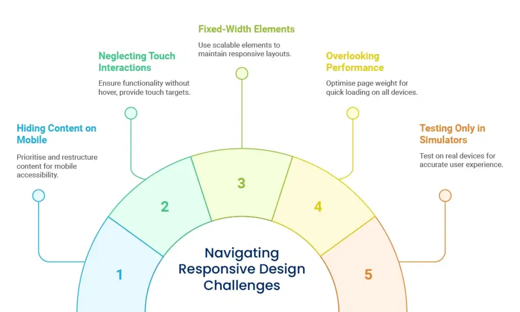
Prioritize and reorganize your content instead of hiding it on smaller screens. The same information should be available to mobile users as it is to desktop users, but presented more effectively.
Keep in mind that touch devices do not support hover states. Make sure all features are usable without hover interactions, and give fingers of all sizes enough touch targets.
Your website responsive layout may be broken if you embed fixed-width elements like tables, images, or third-party widgets. Always make sure that every component can reformat for smaller screens or scale appropriately.
If a website responsive design loads too slowly, it is worthless. To guarantee fast loading on all devices and at all connection speeds, pay close attention to page weight, minimize JavaScript, and optimize images.
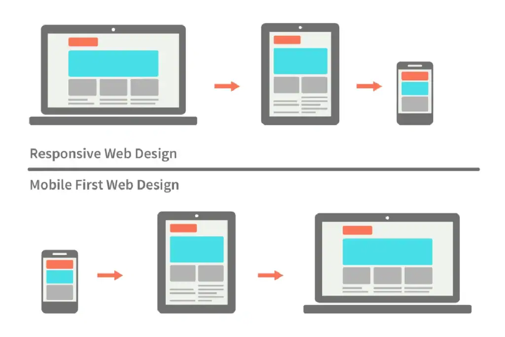
There are two main approaches to website responsive design: desktop-first development and mobile-first development. Depending on the requirements of your project, each offers unique benefits.
Before gradually improving the experience for larger screens, the mobile-first approach begins by designing for the smallest screens. This approach compels you to start by giving priority to the most important features and content.
Benefits of mobile-first development:
For content-heavy websites where information consumption is the main objective, mobile-first development is especially advantageous. Additionally, it’s perfect for projects with a high percentage of mobile traffic, according to analytics.
The desktop-first method scales down and adjusts for smaller devices after designing for larger screens. Complex applications with feature-rich interfaces that gain from more screen real estate may find this suitable.
Benefits of desktop-first development:
For data-heavy apps, intricate dashboards, or websites where analytics indicate a preponderance of desktop usage, desktop-first development may be more suitable.
Your target audience, business objectives, and particular project requirements will determine the best course of action. Due to its alignment with search engine preferences and current usage trends, mobile-first design and development has become the default for many successful website design and development projects.
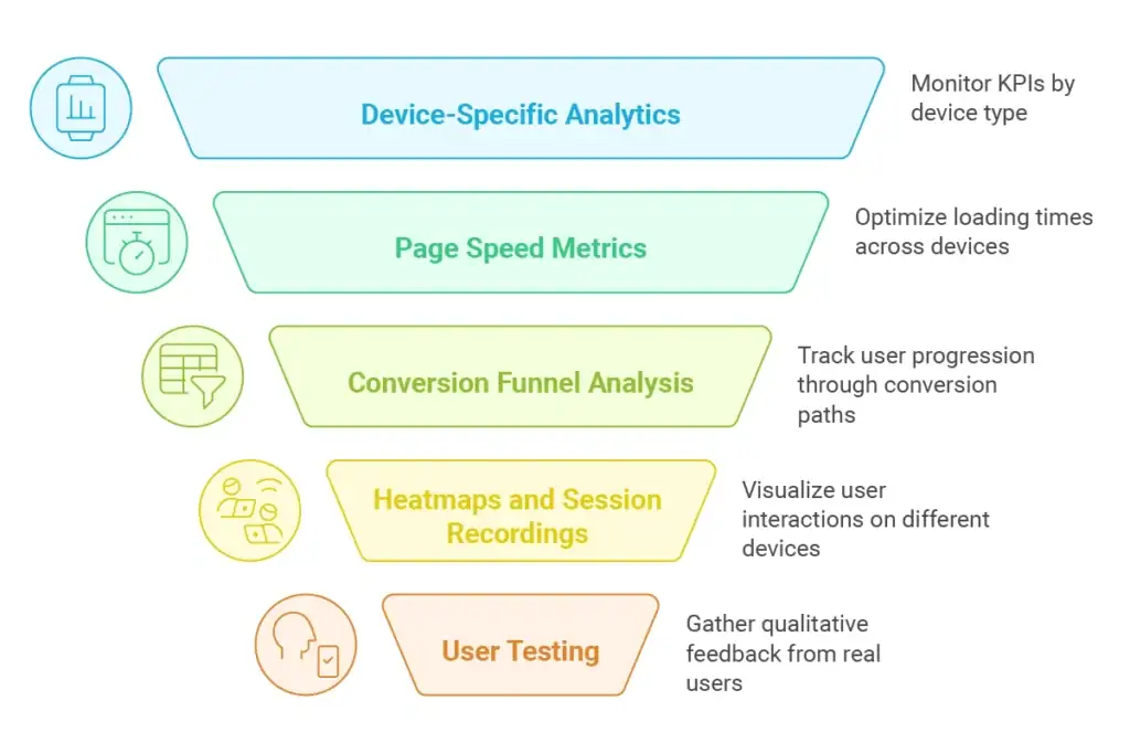
Create precise metrics to monitor performance across devices to make sure your responsive website is really effective:
Track device-specific key performance metrics (such as bounce rate, time on site, and conversion rate) to spot any variations that might point to problems with responsive design.
Measure and improve loading times on various devices using tools like Google PageSpeed Insights, paying particular attention to mobile performance metrics like Time to Interactive and First Contentful Paint.
Monitor user progress along conversion paths across various devices to spot any abandonment points unique to a given device that may require improvement.
To get qualitative input on how actual users interact with your responsive website, conduct moderated usability tests with them across a range of devices.
With new gadgets and screen sizes appearing on a regular basis, the digital landscape is always changing. The following tactics will help you maintain the efficacy of your responsive approach:
Instead of creating fixed page layouts, create a modular design system with components that can change depending on the situation.
Use viewport-based font scaling to do away with the need for multiple text-size breakpoints by automatically adjusting text size based on screen width.
Keep up with new CSS features like container queries, which let elements react to the size of their parent container instead of just the viewport.
To find and fix compatibility problems early, set up a timetable for testing your website on new hardware and browsers as they become more widely used.
Website Responsive design is now essential for success in the digital sphere. In addition to satisfying user preferences, you’re laying the groundwork for long-term growth in a world that is becoming more and more mobile-first by designing seamless experiences across all devices.
Keep in mind that responsive design is more than just technical implementation; it’s about knowing what your users need in various situations and making sure they have a positive experience on your site no matter how they get there. When responsive design is used carefully, it produces digital experiences that adjust to various screen sizes as well as the various ways users engage with your brand on the internet.
You can build websites that not only look fantastic on all devices but also genuinely support your business goals through improved user experience and online optimization by collaborating with seasoned experts who comprehend both the technical and strategic facets of responsive design.
It takes both technical know-how and strategic vision to create responsive websites that work. With user-centric, results-driven solutions, our team of experts can help you build a new responsive website or optimize your existing one for improved cross-device performance. Our all-encompassing approach to web design and development guarantees that your website not only functions flawlessly on all platforms but also advances your larger corporate objectives.
Enter your email to get instant access