
Custom Design
Imagine this: A prospective client comes to your site, scrolls through your social media, and then grabs your business card. Does every touchpoint feel like something owned by the same professional brand? Or does it feel like they’ve been exposed to three different businesses?
Design elements are the aesthetic building blocks that bring about this effortless experience through every customer touchpoint. When executed well, they turn fractured brand touchpoints into a coherent visual narrative that establishes trust, recognition, and professional authority.
This in-depth guide will take you through creating a strategic foundation for your digital design components, applying fundamental visual systems, and building the consistent visual interactions that convert casual browsers into invested customers.

Design elements are the basic visual building blocks that make up the core of your visual brand and user experience. Consider them to be the visual language your brand employs to communicate—such as colours, typography, imagery style, layout pattern, spacing, and interactive elements.
Unlike random visual decisions, intentional design elements play together as an organized system. They build visual cohesion that enables customers to immediately recognize your brand, perceive your professionalism, and intelligently navigate your digital experiences.
For entrepreneurs, design features have a direct influence on customer behavior. Repeated visual experiences can boost brand recognition by as much as 80%, eliminate customer confusion, and communicate the degree of attention to detail customers may expect from your services or products.

Consistent design elements immediately convey professionalism and care. Customers view your business as established and credible when they see the same visual standards on your website, social media, and marketing materials.
Strategic visual coherence makes your brand immediately recognizable. Customers who experience your content on various platforms will better recall your business, resulting in greater brand recall and repeat usage.
Well-crafted elements provide clear navigation and minimize mental burden. When customers know how to engage with your digital assets, they're more likely to make desired actions such as purchases or contact form submissions.
Your brand will stand out within saturated markets through unique design touches. Competitors can do the same thing, but your unique visual strategy is a memorable point of difference that drives customer decision-making.
Design systems in place shorten time to produce content and lower the cost of design. With parameters in place for colours, fonts, and layout, producing new marketing material is quicker and cheaper.
Your branding elements hold your company to the same level of professionalism whether consumers discover you through Instagram, Google, or word-of-mouth. Consistency supports your brand message and accumulates brand awareness.
Strategic Foundation: Constructing Your Design Architecture
Your design foundation is where you begin with understanding the personality of your brand and the expectations of your target audience. Professional services companies require varying visual strategies compared to creative studios or retail brands.
Start by determining the visual personality of your brand. Are you friendly and relatable, or premium and sophisticated? This initial decision will guide each design decision from colour temperature to typography weight.
Keep your audience’s visual tastes and your industry’s expectations in mind. Most healthcare brands require clean, reliable design elements, but creative agencies are free to push bold, artistic styles.
Visual Hierarchy and Information Architecture Excellence
Visual hierarchy directs customer focus through your content in a rational, intentional order. Effective hierarchy employs size, colour, location, and contrast to bring attention to the most crucial information first.
Primary content such as headlines and call-to-action buttons must control the visual real estate. Secondary content supplies supporting data without vying for attention. Tertiary content supplies extra context where necessary.
Good information architecture arranges content sensibly. Customers must be able to comprehend where they are, what they can do, and how to locate what they require within a few seconds of arriving at any page.
Color Psychology and Strategic Brand Integration
Colours elicit emotional reactions and drive buying behavior. Blue fosters trust and credibility, so it is well-suited to use for financial and healthcare companies. Green connotes expansion and longevity, and orange connotes urgency and excitement.
Your palette must have primary colours as the dominant colours for dominant elements, secondary colours for highlights and accents, and neutral colours for text and backgrounds. Try to limit your palette to 3-5 colours in order to retain visual consistency.
Keep colour accessibility in mind by making sure there is enough contrast between text and background. WebAIM’s contrast checker tool ensures that your colours pass accessibility tests while still looking good.
Typography and Content Presentation Excellence
Your typography decisions speak to your brand character before anyone actually reads anything. Simple, clean modern fonts imply innovation and effectiveness. Classic serif fonts imply establishment and credibility.
Create a strong typographic hierarchy with clear headline, subheadline, body text, and caption styles. Regular spacing and sizing provide rhythm and readability throughout all content.
Keep loading speed in mind when choosing fonts. Web-safe fonts are quicker to load than custom fonts, but custom typography can enhance brand distinction. Balance visuals with performance demands.
Check all current brand materials—website, social media accounts, business cards, presentations, and marketing collateral. Record present colours, fonts, imagery tone, and layout habits.
Spot inconsistencies and loopholes. Are you employing varied blues on different platforms? Do your social media images fit your website look? This audit lists areas that require standardisation.
Choose 2-3 main colours that best depict your brand personality and appeal to your target market. Use colours with high contrast ratios for accessibility and professional look.
Select 1-2 main fonts for headings and body texts. Use fonts that are readable in multiple sizes and perform well on digital platforms. Opt for buying professional licenses for future-proof access.
Create templates for frequent materials—social media updates, presentations, web page headings, and email signatures. Templates preserve consistency and accelerate content generation.
Write spacing standards, color codes, and font requirements in an easy brand guide. Add examples of proper and improper usage to keep quality consistent for team members or vendors.
Create consistent button styles, form controls, and navigation elements. Users need to intuitively know how to interact with your digital assets through recognizable visual signals.
Develop hover effects and animation principles that support user experience without taking attention away from content. Subtle interactions look professional and interesting.
Make design elements function well on desktop, tablet, and mobile. Test for colour legibility, font readability, and interactive controls on different screen sizes.
Use touch-friendly design for mobile users. Buttons and links need to be large enough for finger navigation but elegant enough for desktop use.
Simplify visual impact against the speed of loading. Compress images, optimize fonts, and reduce code bloat slowing down user experience.
Test page load times regularly and simplify design complexity when necessary. Gorgeous design with slow load times annoys customers and damages search engine rankings.
Review new materials and content for consistency regularly. Install approval processes that identify inconsistencies prior to publication.
Collect user feedback on visual experience and navigation simplicity. Customer feedback refines design elements for greater engagement and conversion.
Train team members and external partners regarding design standards and the need for consistency. Offer concise guidelines and templates that ensure correct implementation is simpler than using shortcuts.
Ongoing training sessions ensure standards are maintained as your team expands and design requirements change.
Interactive design elements cross the boundary between visual beauty and functional involvement. They direct users through your digital experiences while establishing brand identity.
Buttons must communicate their function through size, color, and location. Primary ones such as “Buy Now” or “Contact Us” require visual dominance, while secondary ones remain available but less prominent.
Consistent navigation diminishes user confusion and creates trust. Regardless of whether customers begin on your homepage or enter through a blog post, they need to recognize instantly how to navigate your offerings.
Professional form design heightens completion rates and demonstrates your regard for customer experience. Clear labels, rational grouping, and visual feedback enable users to fill in forms effectively.
There is a need for visual feedback that confirms actions have been registered. Loading animations, success messages, and error states ought to be consistent with your design aesthetic while communicating clearly.
Recognizing how brand identity design affects user interaction creates more effective interactive elements that enhance aesthetics as well as functionality.
Your design elements need to work flawlessly on all devices and screen sizes. Responsive design is not a suggestion—it’s imperative for digital professionalism.
Begin design decisions on mobile screens and then build out to larger screens. This process ensures critical functionality and visual hierarchy function on the most limited canvas first.
Icons, logos, and graphics require sharp look at different sizes. Vector-based objects are more scalable than raster images and do not lose quality at different resolutions.
Touch interaction happens in mobile devices, calling for bigger tap targets and a different set of hover state considerations. Design elements must support finger navigation without compromising desktop beauty.
Various devices possess differing processing capacity and network speed. Optimize images, reduce animations, and perform testing across representative devices your customers rely on. Effective digital marketing strategies call for design components that function uniformly throughout all digital touchpoints and stages of the customer journey.
Design elements address user experience needs, not aesthetic tastes. All visual decisions must facilitate customer tasks and business goals.

Simple design features eliminate mental effort to process data. Legible typography, sufficient white space, and structured organization enable customers to concentrate on your message and offerings.
Design features should function for users with varying abilities and technical configurations. High contrast ratio, resizable fonts, and keyboard navigation capabilities facilitate wider reach.
The visual elements should assist customers in performing desired actions naturally. Targeted application of color, placement, and contrast can enhance conversion rates by placing focus optimally.
Users require clear visual communication regarding system status, successful actions, and error resolution. Unifying design language for these states minimizes confusion and abandonment.
Good design features are worthless if they can bog down your site or pose technical obstacles for clients.

Great-looking images grab eyes, but huge file sizes send clients away. Advanced compression methods preserve visual quality while slashing load times dramatically.
Custom typography improves brand character but degrades initial page load. Intelligent font loading methods keep text legible while custom fonts load incrementally.
Efficient, clean code causes design components to load sooner and react more predictably. Minimize CSS files, remove unused stylesheets, and optimize for critical rendering paths.
The design elements must look uniform on all browsers and versions. Periodic testing keeps customer experience problems away that mar professional perception.
Running extensive SEO optimization makes sure that your design elements are discoverable while they remain visually great.
Implementing slightly different colors, type, or space throughout your website, social media, and printed materials leads to visual confusion and dilutes brand recognition.
Gorgeous design that impedes user activities or reduces interactions ends up damaging business outcomes. Settle for both visual attractiveness and functional usability needs.
Designing for the desktop first and then tweaking for mobile as an afterthought develops inferior mobile experiences. With mobile traffic leadership, this is harming customer acquisition and retention.
Too complicated designs with excessive colours, fonts, or interactivity overwhelm consumers and impair message clarity. Simplicity tends to convey professionalism better than complexity.
Slow page loading caused by heavy design elements gives negative first impressions. Customers want fast, responsive experiences despite visual complexity.
Design elements must be constantly monitored and strategically updated to ensure competitive edge and customer relevance.

Your visual identity must evolve with your business without diminishing core recognition features. Organize regular reviews and updates that revitalize appearance without mystifying existing customers.
Monitor design trends impacting your industry without pursuing every trend. Strategic adoption of applicable trends keeps your brand contemporary without losing distinctive character.
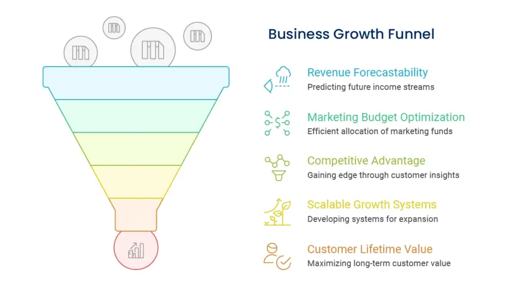
Build independent funnels for upselling and cross-selling existing customers. Such customers already have confidence in your brand, so they are an easy prospect to convert to other products or services.
Monitor the timing and cues that make customers most open to further purchases. Some customers are receptive to instant post-purchase offers, while others require some time to enjoy first-time value before considering expansions.
Regularly gather feedback about visual preferences and usability challenges. Customer insights guide design decisions better than assumptions or industry generalizations.
Monitor competitor visual strategies to identify opportunities for distinctive positioning. Your design elements should clearly differentiate your brand while meeting industry expectations.
Understanding how strategic brand management influences design decisions helps create visual elements that support long-term business objectives rather than short-term aesthetic preferences.
Monitor time on page, bounce rates, and interaction rates in order to determine the impact of design elements upon customer behavior. Better metrics reveal better visual communication.
Track how alterations in design influence lead generation, sales, and other business metrics. A/B testing various visual styles gives data-driven feedback for optimization.
Monitor customer capacity to recognize your brand in various situations periodically. Consistent design should enhance the rate of recognition over time.

New equipment, screen technologies, and modes of interaction surface on a regular basis. The design components must be so adaptable that they change with technology without redesigning entirely.
Accessibility requirements keep evolving, and constant focus is needed to ensure design elements are inclusive and legally compliant across jurisdictions.
Plan how design elements can change with business expansion, market growth, or strategy shifts. Adaptive visual systems support change while maintaining brand equity
Budget for regular maintenance, updates, and training of the design team. Sustained practice calls for committed resources and effort over a period.
Develop extensive documentation that includes colour specifications, typography scales, spacing systems, and guidelines on using components. The documentation guarantees consistent execution across teams and time.
Implement automated testing tools which test colour contrast, font loading, and responsive behavior. Automation detects consistency problems before they impact customer experience.
Position design elements with marketing efforts, product development, and customer service interactions. Homogenization across all business functions enhances brand consistency and customer confidence.
Offer your external partners, vendors, and agencies clear design guidelines when they work on your behalf. Your external collaborators must uphold your visual standards while not sacrificing their expertise.
Knowledge of how performance monitoring translates to design effectiveness enables monitoring of the business returns on visual consistency investments.
Design elements should be updated on an annual basis for effectiveness and appropriateness, with minor adjustments as necessary. Complete makeovers occur infrequently, every 3-5 years or upon major business shifts such as rebranding, market expansion, or shifts in strategy.
Emphasize evolution over revolution—small, incremental improvements maintain brand familiarity without losing sight of keeping your visual identity modern and competitive.
Begin with a straightforward brand style guide of colors, fonts, and general layout guidelines. Utilize free design software such as Canva or Figma to produce templates for standard pieces of material and invest in professional design work progressively on advanced projects.
The point is to create standards early and apply them consistently instead of beginning with costly comprehensive design systems.
Keep essential things such as colors, fonts, and overall look and feel constant while modifying layout and functionality for each platform’s best practices. Your Instagram postings can be more graphics-heavy than your LinkedIn postings, but both can most definitely be unmistakably yours.
Emphasize consistent brand character and visual motifs over exact layouts across multiple platforms and situations.
Design elements create the visual building blocks that unify disparate business touchpoints into coherent brand experiences. Strategically applied, they establish customer trust, enhance user experience, and instill the professional presence that fuels business growth.
The secret to success is having definite visual standards, putting them into practice consistently throughout all touchpoints, and refining constantly from customer input and business development. Your design components should function as a cohesive system that maximizes both aesthetic value and functional use.
Begin with a stable base of colors, type, and simple templates, and then, as your business expands, develop your design system incrementally. Focus on the fact that consistency is more important than complexity—simple, well-implemented pieces of design trump elaborate systems that are not implemented coherently.
Developing consistent visual experiences needs strategic planning and talented execution. Our staff assists companies in creating design elements that establish brand awareness, enhance customer experience, and facilitate long-term growth goals.
We collaborate with you to create visual standards that express your brand personality while being practically business-friendly across all digital and non-digital touchpoints.
Enter your email to get instant access