
Our Core Services
Color Palette Development: The Complete Framework for Creating Harmonious Color Systems
Color palette: Having trouble deciding on the proper colors for your brand? Sorting through infinite shades and combinations can be daunting, particularly when you understand that these decisions will dictate how folks perceive your business. A well-crafted color palette does more than simply look good—it expresses your brand’s persona, drives customer emotions, and builds recognition that can last decades.
In this guide, we will disassemble the whole process of creating the colour palette into easy-to-follow steps. You will discover real-world frameworks for choosing colours that reflect your brand values, blend well together, and make the desired impression on your audience.

What is Color Palette Development?
Color palette development is the planned process of choosing, organizing, and defining a consistent collection of colours that symbolize a brand or design system. In contrast to arbitrary colour choice, a developed palette adheres to systematic principles and forms a deliberate visual vocabulary that conveys precise messages.
An entire colour scheme usually consists of primary brand colours (most used), secondary colours (for supporting materials), accent colours (for call-to-actions and highlights), and neutral shades (for backgrounds and text). These colors exist as a system, not individual selections, in visual harmony serving distinct functional roles on all brand touchpoints.
For companies, colour palette creation is not just an exercise in aesthetics—it’s a carefully considered business strategy that impacts anything from customer impression to marketing efficiency.

Why It Matters for Your Brand or Business
A strategically created colour palette provides a number of essential benefits to your company:
Brand Recognition
Repetitive use of colour greatly enhances recall of your brand. Studies indicate colour boosts brand recognition by as much as 80%, and it can become a key driver for differentiation in congested markets.
Emotional Connection
Colours evoke certain psychological reactions. The proper palette can express your brand personality—whether trustworthy, innovative, friendly, or luxury-oriented—within an instant.
Decision Influence
Research indicates that as many as 90% of product snap decisions are made based on color alone. Your color set can have a heavy influence on buying decisions.
Communication Efficiency
Carefully selected colors assist users in finding their way through interfaces, comprehending hierarchy, and performing intended actions without having to rely on text.
Competitive Differentiation
A unique palette allows you to differentiate yourself from the competition and own certain color associations in your market.
Consistency Across Touchpoints
A formal color Palette guarantees your brand appears consistent across physical materials, digital channels, settings, and products.
Key Color Palette Frameworks
- The Color Wheel Framework
- The Brand Personality Framework
- The Functional System Framework
The Color Wheel Framework
The color wheel is the basis for building harmonious color relationships. In place of random choice, this system guides you to make decisions based on established color theory principles:
- Complementary: Colors that are opposite one another on the wheel (blue/orange, red/green) produce high contrast and visual stimulation, good for contrasting important elements.
- Analogous: Colors next to one another (blue, blue-green, green) create a harmonious, cohesive look that is excellent at building flow and continuity.
- Triadic: Three colours equally spaced around the wheel offer contrasting balance while remaining harmonious, with ample variety for sophisticated brand systems.
- Monochromatic: Different tints, tones, and shades of a single colour produce an upscale, coherent palette that’s simple to execute consistently.
This system guides you past individual taste to build palettes that contain inherent visual harmony.
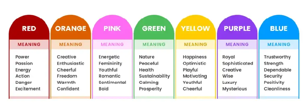
The Brand Personality Framework
This method couples color Palette selection with specific personality traits you desire your brand to embody:
- Trust & Stability: Blues and soft earth tones send the message of professionalism, dependability, and trust, making them ideal for money, health, or B2B businesses.
- Energy & Passion: Reds and oranges create excitement, confidence, and emotion, and are well-suited to brands emphasizing physical activity, creativity, or innovation.
- Growth & Harmony: Greens resonate with nature, growth, health, and harmony, so are suitable for wellness, eco, or education brands.
- Luxury & Distinction: Rich purples, metallics, and deep neutrals convey high-end positioning, refinement, and rarity.
- Approachability & Optimism: Yellows and pale oranges indicate approachability, accessibility, and optimism, so are suitable for mass-market or family brands.
By using this framework, your colours are actually reinforcing your strategic brand position instead of undermining it.
The Functional System Framework
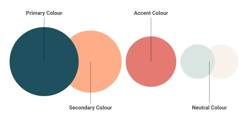
This applied method categorizes colors according to their exact functions in your communication system:
- Primary Brand Colours: Your most frequent colours with the strongest brand association (usually 1-3 colours).
- Secondary Support Colours: Add depth to your colour palette without disrupting harmony, supporting details and adding diversity (usually 2-4 colours).
- Accent Colours: Strong-contrast choices applied minimally for emphasis, calls-to-action, or drawing attention to information of high importance (usually 1-2 colours).
- Neutral Background Colors: Less intense colors that provide the background to content, such as whites, greys, beiges, or muted tones (usually 3-5 variations).
- Functional Feedback Colors: Colors that convey status, such as success (usually green), error (usually red), warning (usually yellow/orange), and information (usually blue).
The system keeps your palette working toward useful communication needs but remains visually cohesive.
Bring Your Vision to Life: Develop a Striking Color Palette Today!
Step-by-Step Color Palette Development Guide
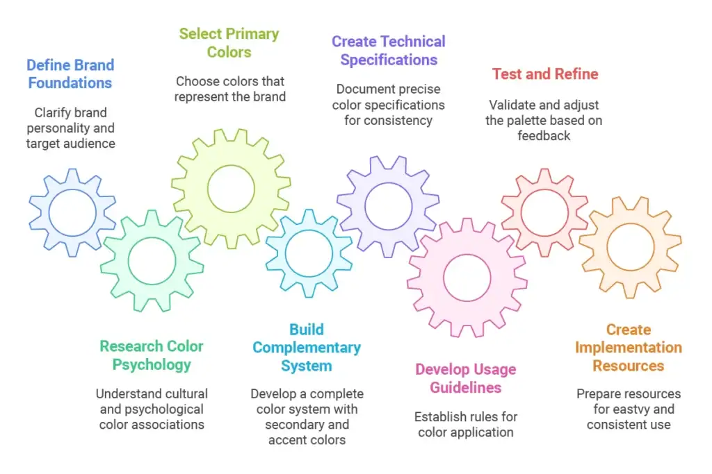
1. Define Your Brand Foundations
Prior to choosing colours, define the strategic foundations that will guide your decisions:
- Record your brand personality traits (e.g., innovative, friendly, premium, trustworthy)
- Define your target audience demographics and interests
- Examine competitive use of colour to determine opportunities for distinction
- Consider the conventions of colour in your industry and whether to comply or defy them
- Consult any pre-existing brand colours that are to be integrated
These foundations set the strategic framework for all subsequent colour decisions.
2. Research Color Psychology and Cultural Associations
Various audiences will respond to colors differently depending on cultural heritage, industry norms, and personal connotations:
- Find out how your target audiences generally react to various colors
- Take into consideration cultural connotations within markets that you serve (e.g., white represents purity in Western cultures but mourning in certain Eastern cultures)
- Find research in color studies that is pertinent to your particular industry
- Test out initial color Palette concepts with your target audience representatives
This study prevents unwanted negative connotations with your palette.
3. Select Your Primary Brand Colour(s)
Your lead brand colour is likely your strongest differentiator:
- Select 1-2 colours that most aptly reflect your essential brand personality
- Think ownability—are you able to “own” this colour in your competitive landscape?
- Experiment for versatility across uses (digital, print, environments)
- Make sure it works well in both large uses (backgrounds) and small uses (icons)
- Check for adequate contrast with text for readability
Your lead colours will be seen most often and have the most brand recognition value.
4. Build a Complementary System
Build out your primary colours into an entire, workable system:
- Add secondary colours that harmonise with your primary colours based on colour harmony principles
- Add accent colours for highlights and calls-to-action
- Build a set of neutral tones for backgrounds and text
- Build tints (colour + white) and shades (colour + black) of your core colours for adaptability
- Test the entire palette as a whole to ensure all colours play nicely together as a system
A complete system provides flexibility without loss of consistency.
5. Create Technical Specifications
Document accurate color specifications for repeatable reproduction:
- Establish CMYK values for print use
- Use RGB and hexadecimal codes for electronic use
- Add Pantone® matching system (PMS) colors where budget permits for specialty printing
- Document color recipes for any physical material (paints, textiles, etc.)
- Produce swatch libraries in applicable design software formats
These specifications guarantee repeatable reproduction in all media and uses.
6. Develop Usage Guidelines
Establish unambiguous guidelines on how to apply your colours:
- Establish colour precedence and primary/secondary use scenarios
- Outline text and background colour combinations that provide for legibility
- Record accessibility requirements and WCAG conformance for digital use
- Develop correct and incorrect usage examples of colour application
- Outline colour ratio (e.g., 60% primary, 30% secondary, 10% accent)
Clear guidelines avoid misuse that compromises your brand visual coherence.
7. Test and Refine
Verify the effectiveness of your palette prior to finalization:
- Test colours in real application scenarios (not only as single swatches)
- Ensure legibility at various sizes and formats
- Ensure colours appear correct on various devices and print processes
- Ensure compliance to accessibility standards, especially colour contrast
- Test with feedback from major stakeholders and representative audience members
This testing reveals issues before your palette is rolled out at scale.
8. Create Implementation Resources
Make correct implementation simple by preparing resources:
- Create digital colour libraries for design applications
- Design templates with pre-defined colour styles
- Prepare physical colour standards for material sampling
- Document colour conversion tables for various applications
- Ideally, create simplified palettes for certain use cases
The simpler your palette is to use correctly, the more consistent your brand will look.
Recommended Color Palette Tools and Methods
Color Selection Tools
Adobe Color
Great for investigating colour harmony relations and viewing colour trend information.
Coolors.co
Good for generating harmonious colour palettes and investigating colour variants in a hurry
Khroma AI
Uses AI to provide suggestions of palettes from your colour tastes
ColorBox by Lyft Design
Assists in making systematic colour scales for digital use
Colour Testing Methods
Grayscale Conversion Test
Turn your palette grayscale to ensure that contrast relations are still defined without colour
A/B Testing
Test various colours in live communications and compare performance metrics
Colour Blindness Simulation
Try using software such as Stark or Colorific to see how your palette looks to individuals with various types of colour blindness.
5-Second Test
Flash your palette momentarily in front of test subjects and ask them what they recall and what emotions were created
Common Color Palette Development Mistakes
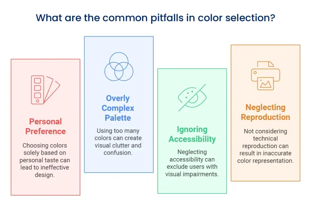
Selecting Colours Based Only on Personal Preference
Most entrepreneurs select colours merely because they like them, regardless of brand strategy or consumer appeal. Such subjectivity leads to ineffective palettes that do not further business goals or resonate with target markets.
Solution: Found colour selections on brand strategy, consumer research, and objective colour theory concepts instead of personal taste.
Creating an Overly Complex Palette
A too extensive colour palette becomes hard to apply consistently and weakens brand recognition. If all designs employ various colours, visual identity gets broken up.
Solution: Restrict your core palette to 2-3 main colours, 2-4 ancillary colours, and a few neutrals, with specific roles for each colour.
Ignoring Accessibility Requirements
Forgetting about colour contrast can make your communications unusable for individuals with visual impairments, excluding potential business and perhaps breaking accessibility guidelines.
Solution: Make sure text and interactive items have adequate contrast with the background (at least 4.5:1 ratio for regular text) and never use colour alone to send crucial information.
Neglecting Technical Reproduction Considerations
Colours appearing ideal on screen may print differently or be unprintable in some materials, resulting in inconsistent presentation of your brand.
Solution: Test colours for all intended use and specify suitable colour values per medium (CMYK, RGB, Pantone, etc.).
Elevate Your Brand’s Look—Start Your Custom Color Palette Today!
Conclusion
Well-considered colour palettes are a potent commercial asset that works tirelessly to enhance your brand awareness, convey your values, and instill emotional connections with your audience. More than just adornment, your colours are a visual language that says much about who you are as an enterprise.
The best colour schemes find harmony between strategic significance, visual attractiveness, usability value, and technological practicability. By adhering to an organized development process instead of committing random acts, you build a system that represents your brand uniformly in all touchpoints.
Keep in mind that your colour scheme is an evolutionary system that should change strategically as your brand identity design evolves. Periodic review guarantees your colours remain useful for your business goals without losing the recognition you have established.
Need Help Developing Your Brand's Color Palette?
Designing an effective colour scheme is about finding a balance between design needs and business objectives. If you want to build a colour system that enhances your brand identity and furthers your business aims, our colour experts are here to guide the way.
We bring together color theory knowledge with smart brand thinking to design palettes that not only are visually stunning but do the heavy lifting for your company. We design so that your colors will help establish consistent branding and marketing across all touchpoints and set you apart from others.
Knowing how colour fits into your overall visual identity in branding is important to business success. Discover more about our integrated color palette development services and how we can assist in reinventing your brand’s visual language.