
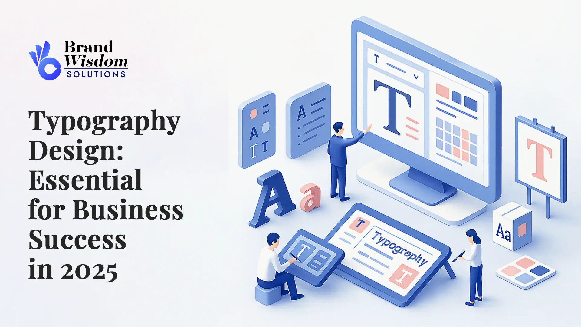
Typography Design: Typography is all around us, showing up on websites, in mobile apps, and on store signs. The way text looks is very important. It mixes how something looks with how it works, so messages look good and are easy for people to read. In graphic design, typography helps show your brand identity. It plays a pivotal role in changing how people see your business any time they use your website, app, or look at your store. As we move through 2025, the principles of typography become a big deal for businesses that want good communication and more user engagement. In this article, you will see why typography really matters for businesses and how it plays a part in your success.
The Role of Typography in Modern Business Branding
Typography shapes how your brand looks and feels. It works like an ambassador for your business and says a lot about who you are. When you pick the right typefaces and design elements, you build a strong brand identity. This helps you get noticed, even in markets that have a lot of other companies.
The way your text looks will change how people see your brand. It tells them about your trustworthiness and what your brand cares about. The choice between serif fonts and sans-serif fonts can change your brand’s style. Also, the way you set up your layout with careful typography will make your message stick with people. If you put typography right into your branding, you can help people remember you. This leaves a strong mark on your audience over time.
How Typography Shapes Brand Perception
The typefaces you pick do more than just add style—they change how people see your brand. For example, serif fonts can give a sense of professionalism and a feeling of history. Sans-serif fonts give the look of modern life and simplicity.
Typography is important for brand recognition. When you stick with the same typeface for your logo, website, and headers, it helps people remember your brand. As time goes on, customers connect the appearance of text and the typeface family you use with your brand identity.
The smaller things matter too. The typeface family you use and the shape of the letterforms have an effect on how people feel about your business. Think about a company’s logo with large, serif fonts. It will show strength and power. If you go the other way and use playful fonts, it makes your brand feel fun and creative. How the text looks, and how well it shows what you stand for helps people trust your brand more.
Building Trust Through Consistent Typography
Consistency with typography is key to good and effective communication. If a typeface is well-structured, users can read and trust the information with ease.
When you design a user interface, the headers, subheadings, and body text need to look the same to help people find what they need. Using the right typography rules, such as the same line spacing and font throughout, helps keep the brand strong. For instance, if an app or site uses the same typeface on all its pages, people will get used to it fast.
From marketing banners to different UI layouts, sticking with the same font size and style makes the experience smoother for everyone. When websites keep changing alignment or fonts, people get confused. This can hurt their trust. So, having steady and simple typography and spacing is very important for building trust in business communication and your interface.
Key Elements of Effective Typography Design
Typography is made up of different design elements. Things like line spacing and letter spacing help make text easy to read and easy for people to use. These spacing choices help the words flow and make the content more open to everyone.
Font styles and sizes matter, too. Big headers are good for drawing the eye to important things. When body text is the right size, it is easier for people to read, no matter which different devices they use. All these ideas are at the heart of great typography. With good design elements, your written content will be clear, easy for people to read, and simple for them to use.
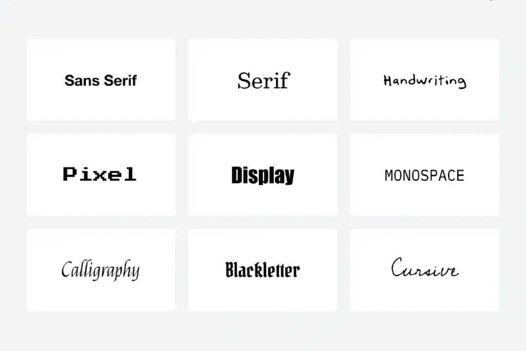
Fonts, Typefaces, and Their Impact
Choosing the right font and typeface has a big effect on your design. Serif fonts, such as Times New Roman, give a feel of tradition. But sans-serif fonts, like Arial, harness the expressive power of typography with their modern and clean look.
- Serif Fonts: These are good when you want to show authority and professionalism. You often see them used in books and newspapers.
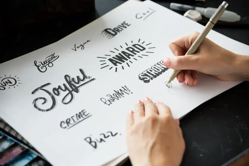
- Different Fonts: You can pick creative or bold options to help your business add style, especially for logos and other brand parts.
- Font Sizes: Big font used in headers can show something is urgent or important. Smaller font sizes are better for long content because they help with readability.
Look at Helvetica—this font is known for its simplicity and is used a lot in corporate branding. On the other hand, using decorative fonts can draw attention, but if you use them too much, it can hurt legibility. Changing fonts and typefaces for each project lets your brand show its own personality. What you choose matters for the feel and readability of your work.
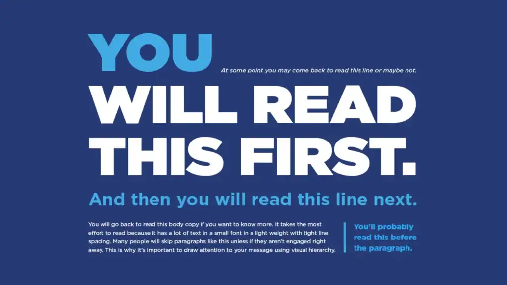
The Importance of Hierarchy and Alignment
Setting up hierarchy and alignment in your design is important if you want it to have an effect. Putting text in a clear hierarchy helps people find the important information fast. For example, headers often use bigger fonts than the body text, so they stand out.
Alignment helps your layout look balanced. It also makes it easy for people to move around the interface. When you use left, right, or center alignment, your text becomes easier to read and follow. Think about seeing headers, logos, and body text all working together on a page. They help guide people and make your design feel connected.
Good spacing and careful alignment help the important elements stand out better. If a business gets its typography hierarchy right, it boosts user engagement and shows what the brand is all about.
Typography and User Experience (UX)
Creating a good user experience needs careful typography. This helps make the text easy to read and simple to understand. Line spacing, letter spacing, and alignment are very important in this. These things work together to help the look of the text and make it better for people. When you pick different font styles, like serif or sans-serif typefaces, these can give different feelings and help build the brand identity.
Using enough white space and following best practices in layout can make sure digital interfaces are easy to use. It also helps your site or app look good on all sorts of devices. When you use the right spacing, font, and alignment, you help with readability and make comprehension much easier. This supports effective communication and helps more people interact with your business. All these things together can build brand recognition and make users have a good time with your brand.
Enhancing Readability for Diverse Indian Audiences
When you make designs for many kinds of people, accessibility should be the first thing you think about. You need to think about people with visual impairments, different reading levels, and those who speak more than one language. This is important for getting typography readability right.
- Body text needs to have enough spacing so people can understand it easily.
- Letter spacing is important for people who have learning challenges.
- For those with visual impairments, you should use font colors that have high contrast.
- UI designs should use both local languages and be easy to read.
Good typography helps everyone be included. It makes it much easier for Indian audiences from all backgrounds to use and enjoy your content. By making these changes, your design becomes useful and welcoming for everyone.
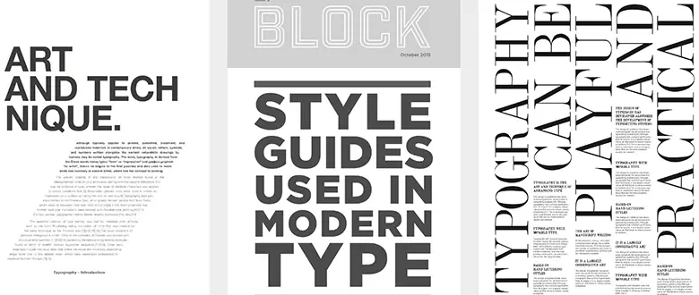
Typography Trends to Watch in 2025
Typography will keep changing to meet the needs of people living in a fast digital age. New trends, such as simplicity and responsive designs, make it easy for people to use different devices.
Companies will need to use typography that can adapt. This includes simple layouts and styles that do not have a lot in them. These new ideas help people move through websites easily and also help with accessibility. As 2025 comes, businesses that try new things with typography will find it easier to reach people on many platforms.
Minimalism and Clean Design
Minimalistic typography is all about simplicity. It removes anything extra, so you only see what matters the most.
If you use white space and negative space, your eyes get more room between lines. This helps things be clear. For example, tools from Adobe often use easy-to-read layouts. This makes sure the typography looks good on any screen.
By picking clean varieties of font, a business can show messages in an organised way. This works well in fast digital spaces. The simpler look cuts out what is not needed. Users can focus on the words with no problem. This makes people pay more attention to what you want to say.
Variable Fonts and Responsive Typography
Variable fonts are a big step forward for typography. Designers can use different styles in one font file, which helps make digital interfaces better and easier to use.
Responsive typography can adjust on its own to fit any screen size. This means it will work well on a phone, a tablet, or any other device. This new way helps the user by giving good readability, even on small screens.
When variable fonts work well, the interface is simple to use. The brand identity stays the same, and the design looks smooth. As digital interfaces grow and change, this type of typography fits what people want now.
Choosing the Right Typography for Your Business
Picking typography starts when you know what your brand is like and what you want to do. There are many different styles to look at, and the technique of arranging them is key. You need to plan this well so that the look of your type fits your goals.
A good starting point is to pick typefaces that go with your business mood. If you have a serious brand, you might choose serif designs. If your brand is fun, then you may like more decorative fonts. Techniques like balance and hierarchy help your typography look better right away.
Reflecting Your Brand’s Personality
Each brand has its own identity, and typography helps show this to people. The style of letterforms and font styles work with the way you share your message. How a font looks can also show what your brand cares about.
For example, healthcare brands often use clear and simple text. They pick serif fonts or other professional-looking font styles to seem reliable. Using neat and streamlined fonts in logos can help people remember them. When you use the right typography that fits your main values, your business can connect with people in a real way. This shows who you are through every font and letterform you use.
Balancing Creativity with Professionalism
Finding the right mix of creativity and clear work style lets your designs fit with many looks. Think about the simple and smart look of serif typefaces like Garamond. These serif fonts show real skill and a sharp look.
- Serif Fonts: These serif styles mix old taste with clean lines.
- Creativity: You can try new typefaces for drawing focus, but do not use them too much.
- Design Elements: Match bold headers with clean body text. This can help your message stand out more.
This way of using design elements works well in busy fields. The right typography, like using serif typefaces and strong headers, helps people trust your work and see your fresh ideas.
Common Typography Mistakes Businesses Make
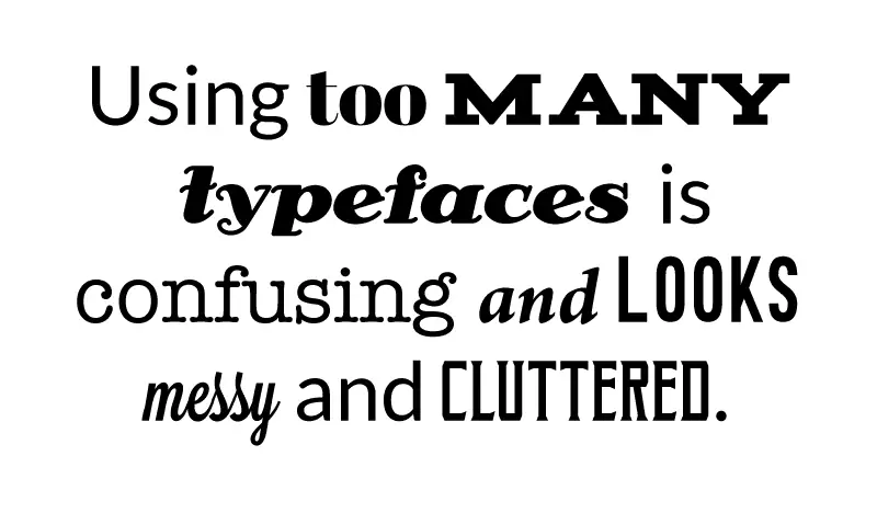
A lot of businesses do not pay enough attention to typography best practices. They often use too many decorative fonts or forget about kerning.
These mistakes can hurt readability and accessibility. It can also turn away potential customers. By focusing on best practices, businesses can avoid these problems. This will help make their communication clear, consistent, and visually strong across all interfaces.
Overusing Decorative Fonts
Decorative fonts can look really nice, but you have to use them carefully. If you use them too much, people can find it hard to read the important body text. This can make the message hard to understand.
It is better to use decorative fonts just for things like logos or banners. For parts with a lot of text, fonts like Times New Roman or Helvetica work better. Good UI design means using decorative fonts less. Using too many can make the page look busy and hard to use. When you use them only where needed, people can more easily see what matters in your ui design, and the content feels more professional. This also makes sure that the readability of your body text stays good.
Ignoring Mobile and Multilingual Needs
Typography has to work well for people who speak different languages and also for those who use phones. If the letters or characters do not line up right across languages or on different devices, then people find it hard to read.
To help everyone, use letter spacing that fits many scripts in each region. When fonts work on phones and change to fit the screen, it helps users take in information with ease across different lines of text. Platforms that choose to focus on worldwide accessibility can reach more people. Good typography and proper spacing help bridge gaps, making content open to many and improving readability for all.
Measuring the Impact of Typography on Business Success
Typography has a big effect on your business. It can change things like how many people do what you want on your site and how clear your words are to everyone.
| Metric | Impact |
| Conversion Rates | Better readability helps more people take action. |
| Brand Identity | Good text styles help users remember your business. |
| UX/UI Design | Clear layouts make user experiences easy to follow. |
When you track these things, you see how typography helps you succeed on different platforms. Good ui design, easy readability, and strong brand identity all work together in this way.
Typography’s Influence on Conversion Rates
Typography has a big effect on how many users take action. The way headers are set up is important. A clear font hierarchy helps get people’s attention fast and leads them to the right pages.
The font you use changes how people see your brand. A clean and professional user interface design makes people trust what you offer. When users go through each page, the body text that is easy to read keeps them interested. This means they are more likely to do what you want, like buy something. Good typography helps the user interface design work better. This can boost your sales and help your business grow.
Conclusion
Typography Design is more than placing letters on a page. It is an important part of how people see your brand. When we look ahead to 2025, knowing small details about typography can help the business stand out from the rest. If you pick the right fonts and keep the style the same, you make your brand easy to know. Good user experience matters, and keeping things clear will help show what your brand stands for.
You want to stay away from mistakes that can hurt your message. Make sure the content works well for everyone who looks at it. As you learn about the new typography trends and see how they can help get more people to take action, remember that good typography is key for your business to do well. Great design is something some people ignore. Think about how using strong typography, good user experience, and staying consistent can help your brand now. If you want advice just for your business, get a free consultation to start.
Frequently Asked Questions
Why is typography so important for my business in India?
Typography helps your business look more trustworthy and strong. The right design elements, like alignment, spacing, and readability, are very important. These things help you reach and connect with India’s multilingual and diverse audience. When you focus on effective communication, people will engage more with your brand.
How do I choose the best fonts for my brand?
Choose fonts that match your brand’s personality. You can pick serif fonts if you want to show that you are professional. Sans-serif fonts make your brand look more modern. Make sure that people can read the text well. The fonts also need to go with your brand’s tone. Trying out different styles is a good starting point. This will help you find the right alignment and legibility.
What are some common typography mistakes to avoid?
Do not use too many fancy fonts. It is important not to mess up kerning, and always make sure the font works well on both phones and in other languages. Follow best practices. Keep spacing consistent, and use a clear font hierarchy. This helps everyone read and understand your text more easily and makes it better for accessibility.
Can good typography improve website performance and sales?
Yes. Clear typography helps people move around a site or app more easily. This makes the user experience better. Good use of fonts and strong order in text guide users. This can make them stay longer, get more involved, and take action. In the end, this can help your sales numbers go up.
What are the top typography trends for 2025 in India?
Minimalism and simple, responsive designs are the big trends in typography in India for 2025. These styles focus on making things easy to read and use. They work well on different devices, like phones or computers. The goal is to make layouts that be easy for everyone to use and understand. With simplicity and better accessibility, businesses can now reach people more easily across all platforms.