
Our Core Services
Typography can make or break your brand identity. Have you ever wondered why some brands feel instantly professional while others seem amateur, even with similar content? The secret often lies in font decisions. Selecting the right fonts establishes your visual voice and shapes how audiences perceive your message before they’ve read a single word.
On this page, we delve into the fundamental principles of font choice for marketers and entrepreneurs. You’ll discover working tactics for selecting fonts that suit your brand values, establish visual order, and maintain consistency throughout all touchpoints. We’ll discuss it all from learning font categories to developing a deep type system that enhances your brand presence.
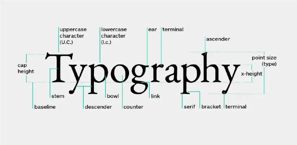
Typography is the art and technique of arranging type to make written language readable, legible, and appealing. It goes far beyond simply choosing pretty fonts—it’s about creating visual language that communicates your brand’s personality and values through the style, arrangement, and appearance of text.
For businesses, typography serves as a powerful, yet often overlooked, communication tool. The fonts you select influence how customers perceive your brand’s reliability, expertise, and overall character. Just as your logo and colour palette speak volumes about your company, your typography choices silently convey messages about who you are and what you stand for.
The fonts you choose aren’t just decorative elements—they’re strategic business assets that impact your brand’s effectiveness in several crucial ways:
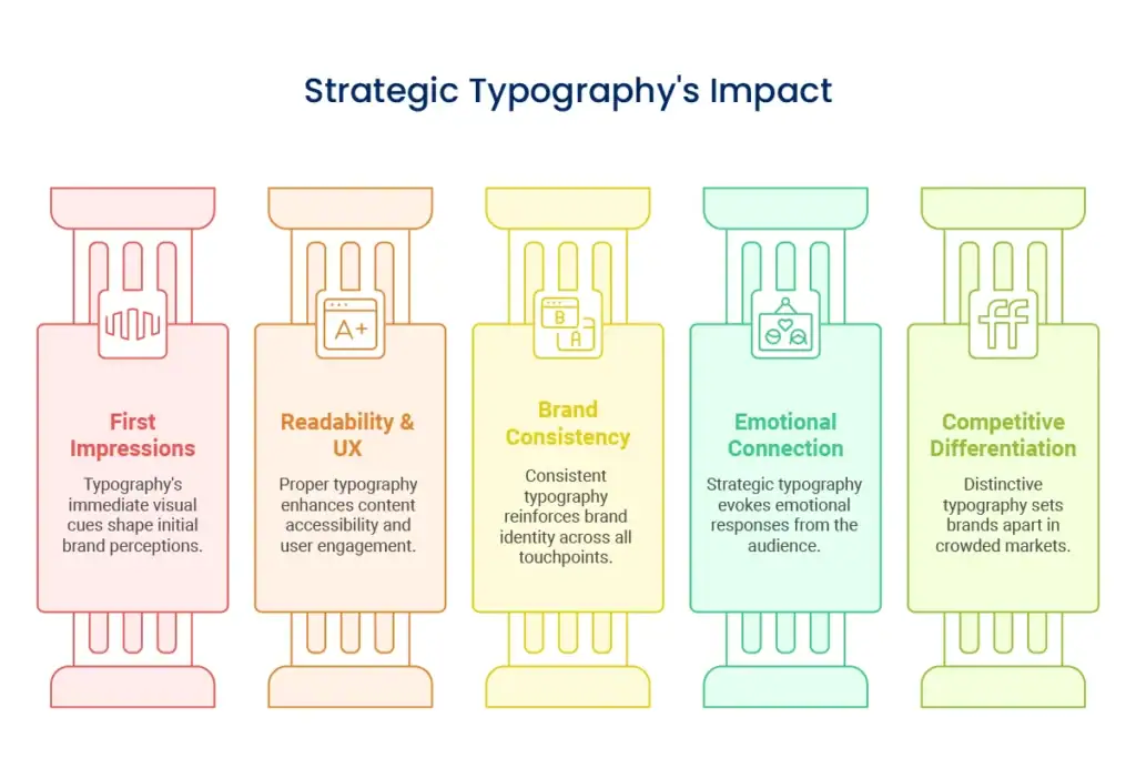
Fonts creates instant visual signals about your brand's character—whether traditional, innovative, fun, or high-end. Design thinking tells us that users make judgments about design in 50 milliseconds of viewing.
Good typography makes your content accessible and easy to read, minimizing cognitive load for your customers. Ineffective decisions can drive bounce rates and abandon carts by inserting unnecessary friction.
Uniform typography throughout all touchpoints reinforces brand recognition and trust. When customers see the same typographic style on your website, packaging, and marketing assets, it solidifies your brand identity.
Various fonts have different emotional connotations. Serif fonts tend to convey heritage and trustworthiness, whereas sans-serif fonts convey modernity and friendliness. Strategic typography assists in establishing emotional bonds with your audience.
Knowing the basic principles of font design will enable you to make sound choices when you’re choosing and applying fonts for your brand.
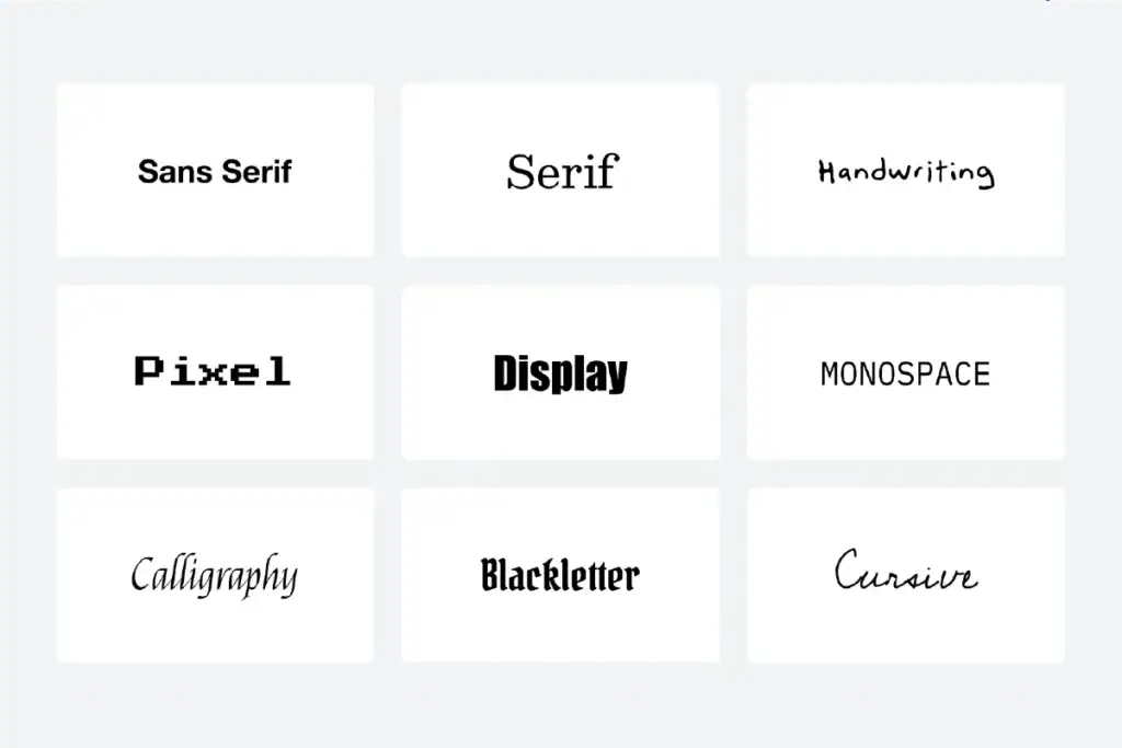
Different font styles carry distinct personalities and historical contexts that influence how they’re perceived:
Serif Fonts These fonts feature small decorative strokes (serifs) at the ends of characters. Serifs create a sense of tradition, reliability, and professionalism, making them ideal for established brands, legal firms, financial institutions, and luxury products. Examples include Times New Roman, Georgia, and Baskerville.
Sans-Serif Fonts These fonts lack decorative strokes, creating a clean, minimal appearance. Sans-serifs convey modernity, simplicity, and straightforwardness, making them perfect for tech companies, startups, and contemporary brands. Popular sans-serifs include Helvetica, Arial, and Futura.
Display Fonts Designed for headlines and attention-grabbing text, display fonts are highly distinctive and often decorative. They work well for logos, short headings, and special applications but should be used sparingly. Examples include Bebas Neue, Playfair Display, and Abril Fatface.
Script Fonts These mimic handwriting or calligraphy, ranging from casual to formal. Script fonts add personality and a human touch, making them suitable for brands emphasising craftsmanship, creativity, or personal connection. Common script fonts include Brusher, Playlist Script, and Great Vibes.
Monospaced Fonts Each character in monospaced fonts occupies the same amount of horizontal space. They convey precision, technical expertise, and functionality, making them appropriate for coding platforms, technical documentation, or brands wanting to signal meticulous attention to detail. Examples include Courier, Roboto Mono, and IBM Plex Mono.
Typography hierarchy uses size, weight, colour, and spacing to guide readers through content by establishing clear relationships between different text elements. A well-structured hierarchy:
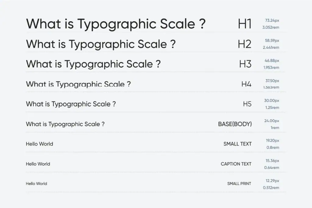
Primary headings (H1): The largest and most prominent text, typically used for page titles or main concepts
Secondary headings (H2): Slightly smaller than H1s, used to introduce major sections
Tertiary headings (H3): Even smaller, used for subsections within major sections
Body text: The smallest and most prevalent text used for paragraph content
Accent text: Captions, pull quotes, or highlighted information that may vary in size but is visually distinct
Font pairing involves combining multiple typefaces to create visual interest while maintaining harmony. Effective font pairing strategies include:
Pair fonts with different characteristics (serif with sans-serif) but similar proportions or x-heights. This creates interest through contrast while maintaining visual harmony.
Use different weights and styles within the same font family (light, regular, bold, italic) for a cohesive look with built-in variety. Many professional font families include numerous variations specifically designed to work together.
Assign specific fonts to specific functions: one for headings, another for body text, and perhaps a third for special elements like pull quotes or buttons. This creates both visual interest and functional clarity.
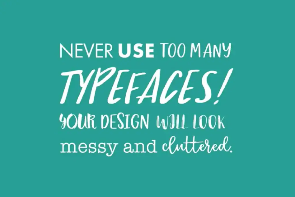
Resist the temptation to use too many fonts. Most professional designs limit themselves to 2-3 font families maximum. More than that risks creating visual chaos rather than harmony.
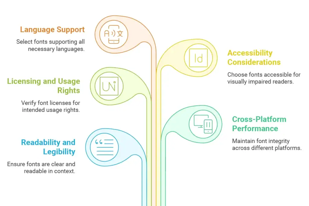
Beyond aesthetics, practical considerations should influence your typography choices:
Fonts must be easily readable at their intended sizes and contexts. Test body text fonts at small sizes and display fonts in their intended applications. Pay special attention to similar-looking characters (like I, l, and 1) to ensure clarity.
If your brand operates internationally, ensure your selected fonts include glyphs for all necessary languages. Many fonts lack support for non-Latin alphabets or even extended Latin characters used in European languages.
Commercial font licenses vary widely. Some allow unlimited usage across all applications, while others restrict usage to specific mediums or user counts. Always verify licensing terms before implementing fonts in your brand system.
Choose fonts that work well for readers with visual impairments or dyslexia. Sans-serif fonts at appropriate sizes with adequate line spacing generally perform better for accessibility. Avoid extremely light weights and ensure sufficient contrast between text and background.
Designing a master system goes beyond selecting good-looking fonts. Here’s how to enhance your brand identity design and business objectives:
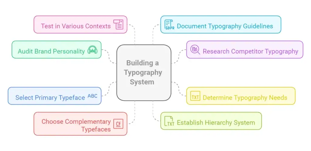
Start by going through your brand strategy reports. Identify 5-8 most important adjectives that define your brand personality (e.g., friendly, innovative, trustworthy). These will dictate your font selection towards fonts that are visually representative of these characteristics.
Examine typography of direct competitors and brands you aspire to be like in your market. Identify which typefaces are prevalent in your category and whether you wish to play by the same rules for category recognition or take a different route for differentiation.
Make a list of all the channels where your font will be used (website, package, advertisements, documents, apps). Each channel has varying needs and limitations that will affect your choices.
Select a multipurpose family of fonts that best reflects your brand's personality and has several weights and styles. This will be the backbone of your type system, normally used for body copy and potentially headings.
Pick one or two other typefaces that complement your main font and perform certain tasks (headlines, data visualization, decorative text). Make sure they establish the proper contrast level without compromising harmony.
Designate precise sizes, weights, and styles for various text components (H1, H2, H3, body text, captions, etc.). Record precise specs for seamless use on all platforms and media.
Designate precise sizes, weights, and styles for various text components (H1, H2, H3, body text, captions, etc.). Record precise specs for seamless use on all platforms and media.
Prior to finalization, test your system on differing media, sizes, and backgrounds. Test readability, emotional response, and technical performance under real-world conditions.
These affordable tools can assist you in applying effective techniques without sacrificing your finances:
A comprehensive, free web font library that is easily deployable on websites. Google Fonts provides great cross-browser support and eased commercial use licensing. The site features useful pairing recommendations and filtering on the basis of categories and traits.
(formerly Typekit) Part of Adobe Creative Cloud subscriptions (starting at around ₹1,600/month), the service offers access to thousands of premium fonts licensed for commercial use. It shines in presenting professional-level typefaces with wide language support and weights.
A free web-based application based on machine learning that creates harmonious font pairs. Just slide the contrast slider to discover sets with differing similarities or differences, so designing pairs is intuitive even for those who are not designers.
This free browser tool from MyFonts is useful for font identification from images. Copy and paste a screenshot of text, and the tool recommends matching or similar fonts—ideal for competitor typography research or discovering the name of a font you've seen and like.
Even experienced designers sometimes fall into these typography pitfalls. Here’s how to avoid them:
Using Too Many Fonts: Many businesses, especially when first establishing their visual identity in branding, select too many different typefaces. This creates visual confusion and dilutes brand recognition.
Solution: Limit your typography system to 2-3 font families maximum. Look for versatile families with multiple weights and styles to create variety without introducing new fonts.
Neglecting Readability for Aesthetics Choosing fonts based purely on their decorative qualities often compromises readability, especially for body text.
Solution: Always test potential fonts at their intended sizes and in realistic contexts. For body text, prioritise legibility over stylistic uniqueness. Save more distinctive fonts for larger headings or special applications.
Inconsistent Implementation Many brands select appropriate fonts but apply them inconsistently across materials, undermining the cohesiveness of their visual identity.
Solution: Create detailed typography guidelines with specific rules for each text element. Include font, size, weight, case, and spacing specifications. Share these guidelines with everyone involved in creating brand materials.
Poor Contrast and Spacing Typography isn’t just about the fonts themselves—it’s also about how they’re implemented. Insufficient contrast between text and background or cramped line spacing significantly reduces readability.
Solution: Follow accessibility guidelines for text contrast (WCAG recommends a minimum contrast ratio of 4.5:1 for normal text). Set line spacing (leading) at 1.5 times the font size for optimal readability in paragraphs.
The fonts you select subconsciously communicate specific personality traits to your audience. Understanding typography psychology helps you select typefaces that align with your intended brand perception.
Serif fonts like Times New Roman, Baskerville, and Garamond convey heritage, reliability, and authority. Their historical associations with printed books and newspapers lend a sense of credibility and established expertise. These fonts work well for:
Geometric sans-serif fonts such as Futura, Gotham, and Proxima Nova project modernity, innovation, and forward-thinking. Their clean lines and mathematical precision communicate efficiency and progressiveness. These fonts excel for:
Rounded sans-serif fonts like VAG Rounded, Quicksand, and Comic Sans (used judiciously) create perceptions of approachability, warmth, and inclusivity. Their softer shapes feel less formal and more inviting. These fonts suit:
Display and script fonts like Abril Fatface, Playfair Display, and Lobster add personality and uniqueness. These distinctive typefaces create memorable impressions but should be used selectively. They work well for:
Typography may appear to be a trivial detail in the course of your brand strategy development, but its implications go far beyond looks. The typography you choose works behind the scenes but with great force in molding audience perceptions, building credibility, and providing lasting brand experiences.
By carefully choosing and applying font that supports your company objectives and brand character, you establish a platform for effective, consistent visual communication. A well-planned typography system not only makes your message appear attractive—it makes it easier to read, supports brand awareness, and builds emotional resonance with your audience.
Keep in mind that typography is not a one-and-done choice. As your brand grows and enters new markets or channels, your typography requirements may shift. Periodically examine your font system as part of your overall brand strategy to guarantee it remains effective for your business goals.
Creating an effective typography system requires balancing aesthetic considerations with practical business needs. If you’re struggling to select fonts that properly represent your brand or need guidance implementing typography consistently across your marketing materials, expert help can save you time and prevent costly mistakes.
Enter your email to get instant access